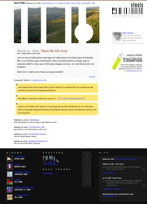
Apologies for the New design
The new look of Shut Theory, explained.
The new design ignores FireFox, adopts CSS base layout, and has a thick bottom. And no more comments.

Alright, it has been over a year since I got this website to run, and ever since, I have been declaring that it has not been designed yet. Well, I have started to see nightmares about it, and finally I designed it.
What's new about this design you say? Nothing much! It is pretty much what the old one was about, vanity blog. Let me discuss with you, the things I have done, and why I am here in the first place—besides wasting your time!
XHTML
The website is not fully compliant to XHTML standards, but it is almost there. I have reasons not to make it fully compliant, mainly the view of my browser usage statistic. Last time I checked, less than 30% of visits were made by other than IE6.0, that is a small portion, yet I did my best to make it compatible with Firefox, and to do that, well, I had to break few standards here and there.
Now for those who defend the beautiful Firefox, I admit, the CSS support is really good, and it works a lot better than on IE. More CSS3 standards are being supported, and enhancements touch performance as well. But, as a Microsoft developer for 5 years—mind you I've done my share of PHP development—there is one magical ingredient in MSIE that not only does not exist elsewhere, but also rules out every competition possible against IE, at least to my personal opinion: CSS BEHAVIORS. I have been developing user interfaces for intranet web-based applications, and you can only imagine how easy behaviors have made my life. You need to write a lot of code to simulate what one simple HTC file does, and that is basically what made me fold back from supporting Firefox ever, and will still be the reason why one day I will stop trying to make things look good on Firefox.
Another reason I won't support Firefox is why bother? If it doesn't behave correctly, why should it look okay? That is my question to all of those who develop things with one thing in mind, that it should work on all browsers, and gracefully degrade to older ones. They never explained themselves! I always argued, and will always argue, if users are dumb enough not to get a new browser, why do we encourage them? And if browser manufacturers are arrogant enough not to unite their standards, let us not encourage them!
CSS-based layout
That's right, no more ugly tables, I wanted to do that a long time ago but lack of time and guts prevented me. I always imagined it to turn out very clumsy, but now that CSS support is getting more mature, things turned out to be amazingly simple.
Embrace Your Bottom
I read this article once on the web, and instantly fell in love with the idea, but please do take note, my navigation is so simple this technique actually works well. Has the navigation been more complex, I would not have done it, users need to see head start, what this website offers them.
No Comments
Not that it ever existed, but I am going along with my policy not to allow comments for many reasons, first of all, I am not blogging for a living. I confess, I am wasting time, yours and mine! The reason I am writing this blog is that I started writing notes one day to fill the gap, and couldn't stop. Another reason is trying out new designs, I get to do whatever I want with no strings attached.
What I basically write here is anything goes, it is not directed to those who do not know me personally, rather to my friends, family, and co-workers, and to my future employers.
So, I believe it is unprofessional to allow comments. When I visit a good article page, looking for information that is going to help me to do a task that is supposed to be done in 2 hours, it drives me crazy to see the number of comments below it. I think too much information is going to kill us!
Enough Said!


