Dare I pink?
Yet another redesign apology
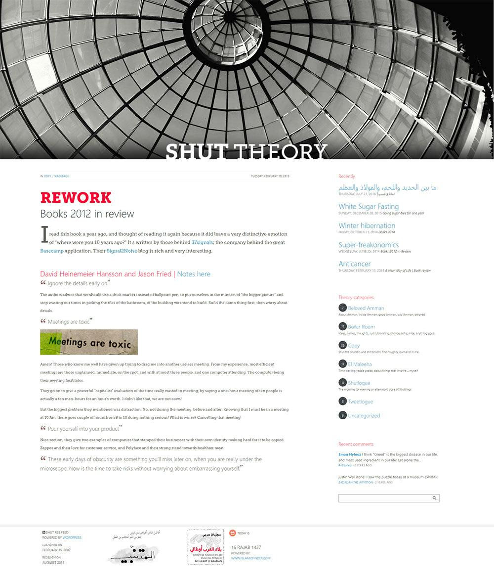
It's been almost seven years since I redesigned this blog, and I am definitely going to miss it. I might even never like a blog again! Here is my new attempt, just to look a bit interested. And following is my apology for the things I removed, kept, and introduced.
Nope, It wasn't trendy!
The old rotten piece of newspaper as the background I fell in love in 2006, well, that wasn't because of the trend (which was so back then), I simply love that look. So I kept that, with the red ink splash and the liquid dry spill. The newspaper layout is something I have always loved, for as long as I remember (which goes back to 8th grade, I don't remember 7th grade very well!). I doubt that will ever go away. The Georgia font however, isn't quite final. Droid Serif is in the house now.
I made up a decision in 2006 to reduce the main page entry to one, and leave the WordPress rest of loop under recently
section. To me that proved to be an excellent decision because I do not blog often, and when I do, I like to leave them behind forever, history is not a favorite subject of mine. [Insert: coming from the future, that proved dreadfully wrong!] On the other hand, displaying the whole blog entry under categories and search result for the same reason, did not quite work, so for those pages, I am reverting back to excerpts.
Disqus provide an excellent service to display recent comments, I used that a couple of years ago and I think it is a major part of blog content.
Gone
Gone is the Twitter feed which proved irrelevant, and my very old, very hard to maintain portfolio. With Behance, and LinkedIn, who needs a portfolio? The Facebook and Twitter links, and share links are also gone. My original website speaks enough about me, and sharing links are provided by Disqus.
What I also decided to get rid of are background creases, because the photos were becoming harder to maintain to make them look right in place. I don't regret having them before though, it was delightful while it lasted.
Dare I pink?
New changes introduced to the blog is the drift towards light fonts and flat UI, not in an flashy way, but I had to look a bit more current. The ajax pager for categories and search results page is also something that I haven't seen around a lot, but I think it's time everyone adopts them.
And finally, I dropped my guards and went with an awful bright color, is it pink? is it red-ish? I have no idea, but I assure you it isn't my favorite. I just need to know for sure, does acquaintance lead to strong relationships, or does familiarity breed contempt? If I don't fix the color in a couple of months, it means I got so familiar with it I forgave it!


